

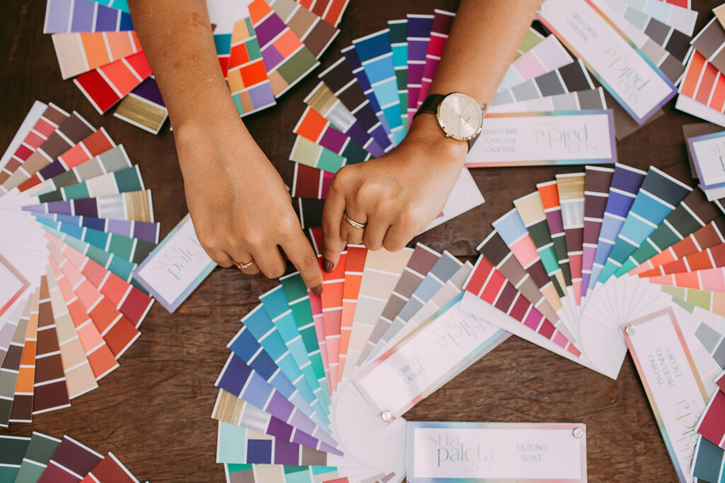
We’ve alllll seen the endless color palettes floating around Pinterest. They’re fun and gorgeous, but many of them aren’t built for real-world design: colors too light for text, too busy for buttons, or using fonts that aren’t even available.
That’s why I pulled together 3 palettes you can really use, complete with HEX codes, free Google Font pairings, and examples of how they look in action.
Why Palettes Matter for Websites
- Consistency builds trust. Repeating colors/fonts across buttons, headings, and body text keeps your site looking intentionally put together.
- Accessibility matters. Palettes with strong contrast keep your site usable for more people.
- Less chaos, more calm. Palettes with a ton of colors are lovely to look at, but can be hard to use, especially on the web. Limiting your palette to a few coordinated shades helps your site feel polished and professional. And if you ever need more variety, you can drop any of the colors into a tints and shades generator to get extra options without losing consistency.
Palette 1: Slate & Rose
Soft but strong, this palette and font pairing brings a quiet warmth that’s perfect for florists, interior designers, and other thoughtful professionals who want to lead with care and quiet confidence.
Slate & Rose Palette
Slate
#4B5358
Shadow
#716E72
Rose
#B4827E
Sand
#D6C3B6
Parchment
#E1DDDB
Mist
#F0EFEF
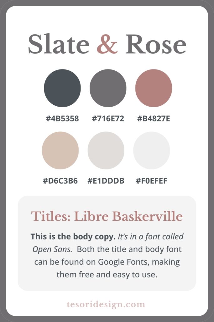
Slate & Rose Font Pairing
- Titles: Libre Baskerville adds a touch of elegance without being fussy.
- Body: Open Sans keeps text legible, even at smaller sizes.
Why This Palette Works
- Slate provides dark, readable text contrast.
- Rose adds warmth and personality without overwhelming.
- Neutrals balance the palette so it doesn’t lean too pink.
- Pairing a serif header with a simple sans body font keeps it elegant yet easy to read.
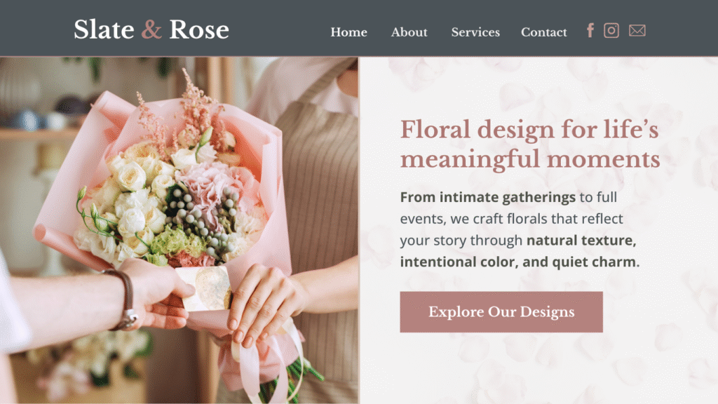
Slate & Rose Website Example
Palette 2: Navy & Gold
Professional yet approachable, this palette and font pairing are a great fit for financial advisors, accounting firms, and consultants seeking to convey trust and expertise.
Navy & Gold Palette
Midnight
#292e3b
Navy
#2a385e
Denim
#3d5494
Gold
#c9a379
Sand
#e6d6c5
Eggshell
#f2f0f0
Navy & Gold Font Pairing
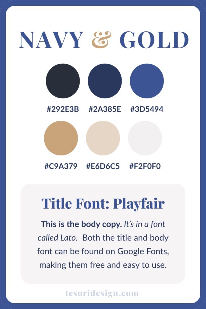
- Titles: Playfair Display brings a touch of sophistication with classic serif styling.
- Body: Lato keeps paragraphs clean, modern, and easy to read.
Why This Palette Works
- Both Midnight and Navy are deep enough for strong text contrast.
- Gold works beautifully as an accent (buttons, highlights).
- The balance of dark, light, and neutral keeps the palette modern but versatile.
- Serif headers feel professional, while Lato keeps paragraphs readable and friendly.
Navy & Gold Website Example

Palette 3: Shadow & Sage
Gentle yet grounded, this palette and font pairing are perfect for wellness practitioners, therapists, and creative services seeking to convey mindful creativity.
Shadow & Sage Palette
Shadow
#3C343A
Muted Violet
#746773
Lavender
#AA99AA
Sage
#98AB98
Soft Mint
#C5D3C5
Cream
#F2F0EB
Shadow & Sage Font Pairing
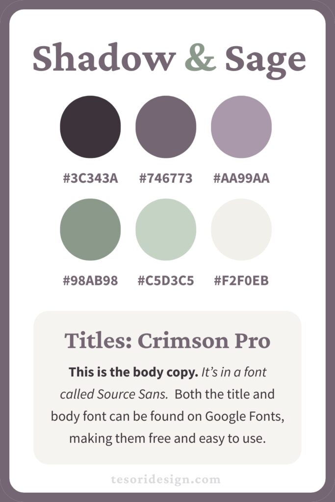
- Titles: Crimson Pro has a warm, literary feel; it’s thoughtful and grounded without being heavy.
- Body: Source Sans is modern and straightforward, making longer text easy to read.
Why This Palette Works
- Shadow and Muted Violet provide dependable contrast for text, making headings and body copy easy to read.
- Lavender and Sage add vibrance as accent colors.
- Soft Mint and Cream lighten the palette, adding warmth.
- The font pairing communicates thoughtfulness while keeping all text clear and modern.
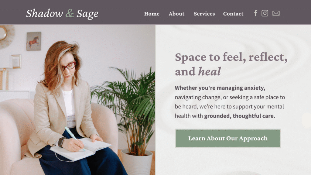
Shadow & Sage Website Example
Not Ready to Swap Colors Yet?
Even if you’re not planning to completely overhaul your palette, you can borrow from these ideas:
- Use a darker shade of your existing brand color for body text.
- Pull in one of these neutrals to balance your current scheme.
- Pair your existing fonts with a new, free Google Font for hierarchy.
The right palette doesn’t just look nice, it makes your brand (and website!) easier to recognize, more trustworthy, and feel more like you.
🎨 Want More Palettes?
I’m putting together a free Website Color Guide with more palette options, and font pairings, and real-world examples. Sign up below and I’ll send it to your inbox as soon as it’s ready. ⬇️