

If I asked you to think of an iconic brand, which one comes to mind? For me, it would be Apple, Nike or possibly Starbucks (clearly my brain is already plotting tomorrow morning’s coffee). Those brands feel so huge and iconic – because they are – but also because they’ve spent decades building a clear, consistent brand that people recognize instantly.
What is branding?
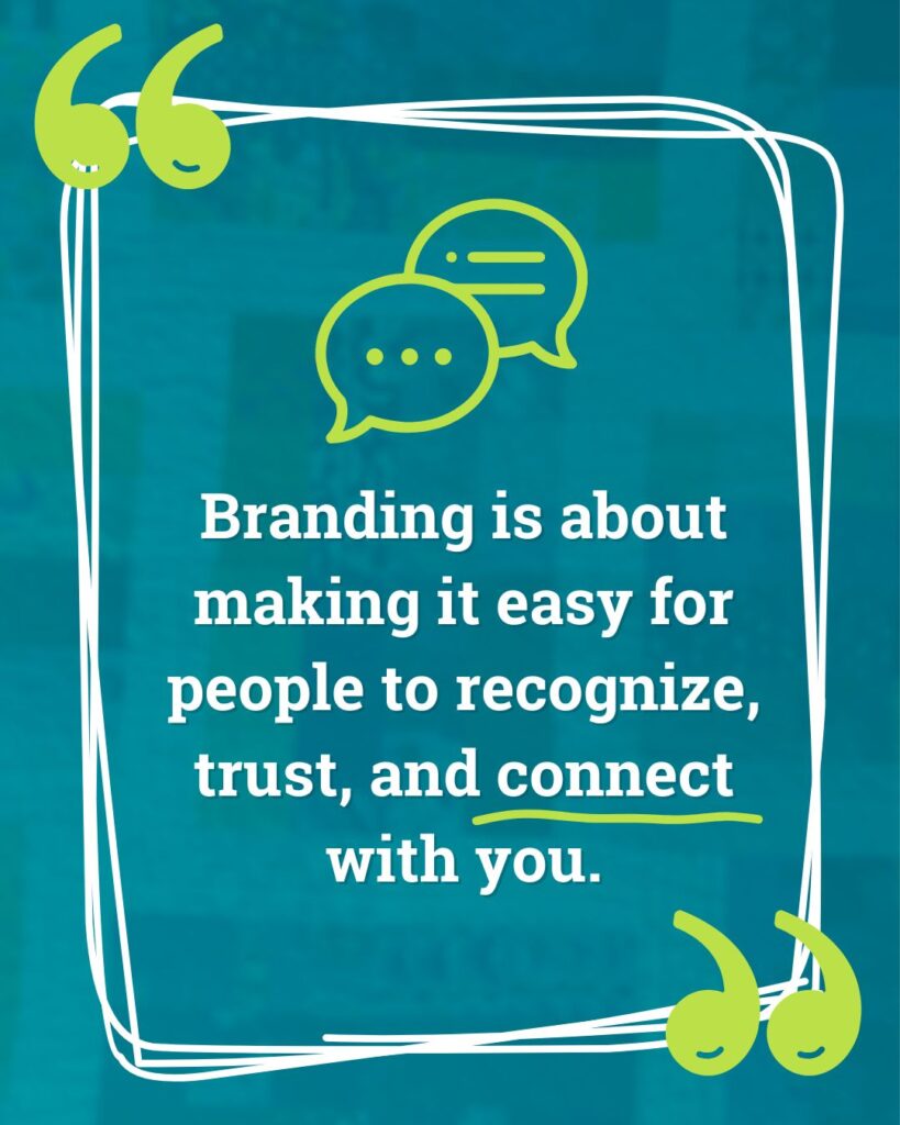
At its core, branding is about making it easy for people to recognize, trust, and connect with you.
Oftentimes, folks think branding is “well, we have a logo” or “ooh we like this shade of blue,” but branding is more than logos and colors. If Nike only had the swoosh, without the history and consistent vibe, they wouldn’t be the giant they are today.
What you’re building is an overall feeling people get when they interact with you. Do you want them to feel confident? Energized? Understood?
Sure, it may start with your logo and colors, but branding also shapes every kind of interaction. On your website, it’s what makes someone land on your homepage and instantly feel like they’re in the right place (or not 😬).
Your brand is that combination of visuals and voice that make you recognizable and relatable.
Why Branding Matters for Small Businesses
Even if most of us don’t have a Times Square billboard budget, consistent branding still makes a huge impact. The biggest thing it offers is trust – showing up with steady colors, fonts, and voice helps your audience feel confident in you. When you look polished and consistent, people are more likely to take you seriously (even if you’re flailing a little bit behind the scenes!).
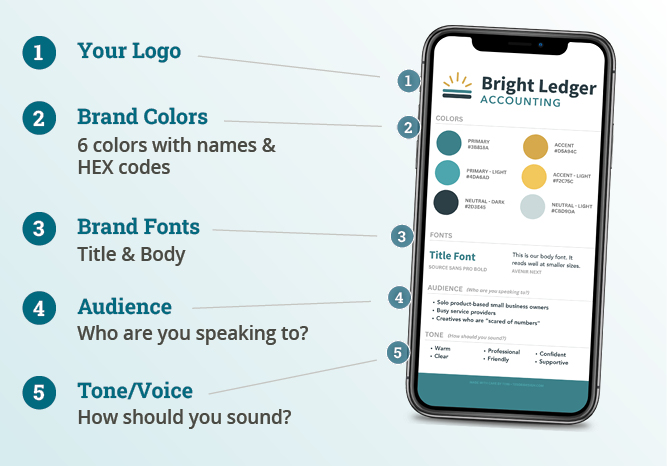
🎁 If you’d like a simple way to remember these pieces as you go, my free One-Page Brand Guidelines Template can help (more below ⬇️).
5 Steps to a More Consistent Brand
Your website is often the first stop for customers, donors, or clients, so let’s break down how to make sure your branding is consistent to help your audience feel comfortable giving you that trust quickly.
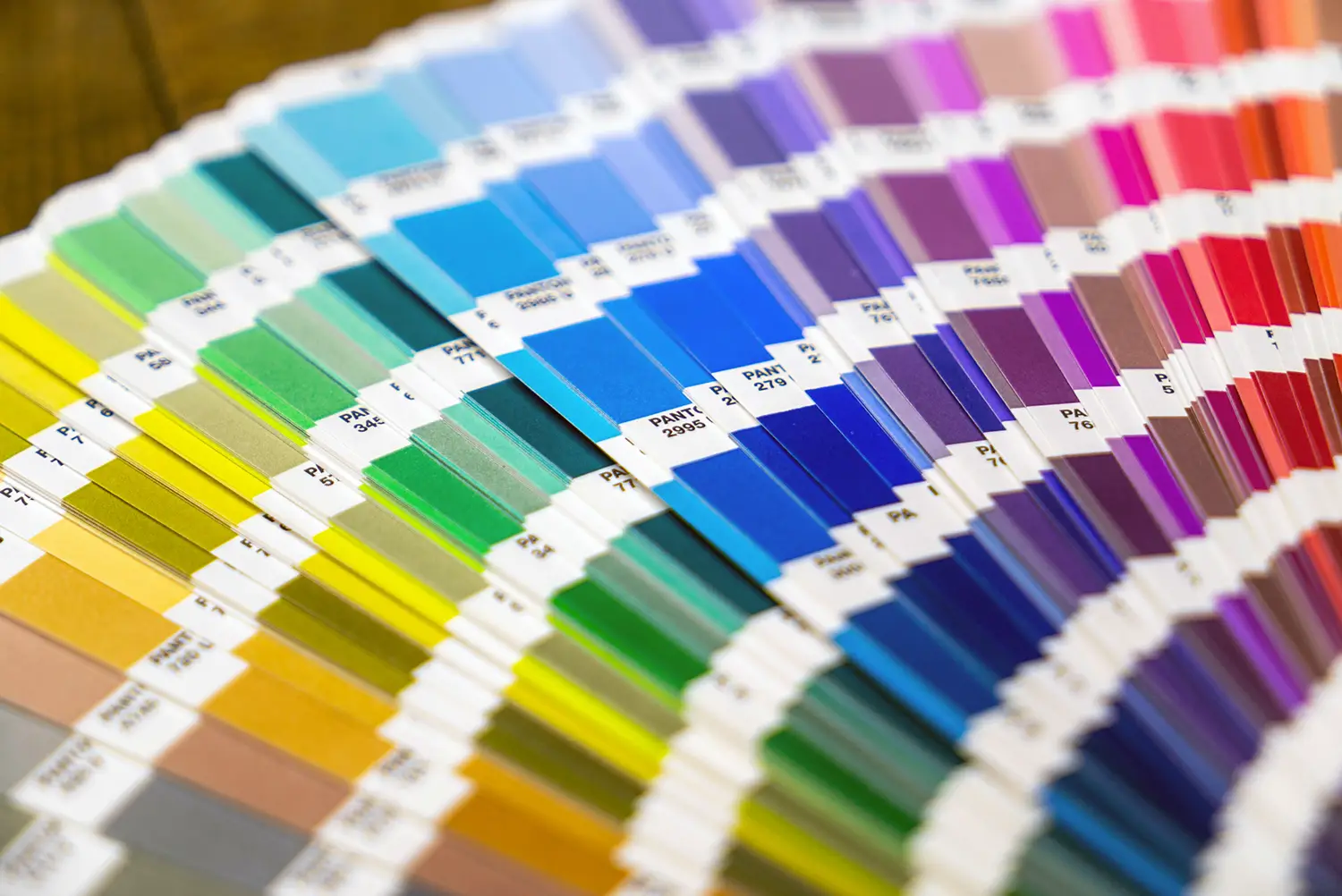
1. Use Uniform Colors
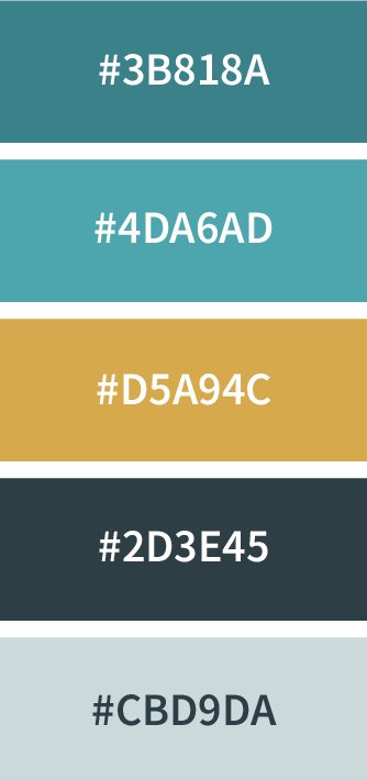
Pick 1–2 colors and use them everywhere. Typically these colors will come from your logo or other brand assets, and you’re looking to dial in a primary color and an accent color.
If you only have one color to use as a jumping off point, you can use Canva’s Color Wheel to generate a coordinating color to use as an accent.
Once you’ve picked your colors save the exact color codes somewhere easy to find. A note on your phone works fine (mine’s literally called Brand Stuff), but I also have a Canva template at the end of the post to make it super-easy.
I find it’s easiest to save the HEX code (that’s the one that looks like this: #343434), because it’s the format that works most consistently across websites, design tools, and other apps.
✅ Quick Bonus Tip: When using color on your website, make sure your text color has enough contrast with your background so it’s easy to read. A free tool like WebAIM’s contrast checker makes checking contrast simple. If you need an adjustment, use a tints and shades generator to create lighter and darker versions of your color.
2. Choose Signature Fonts
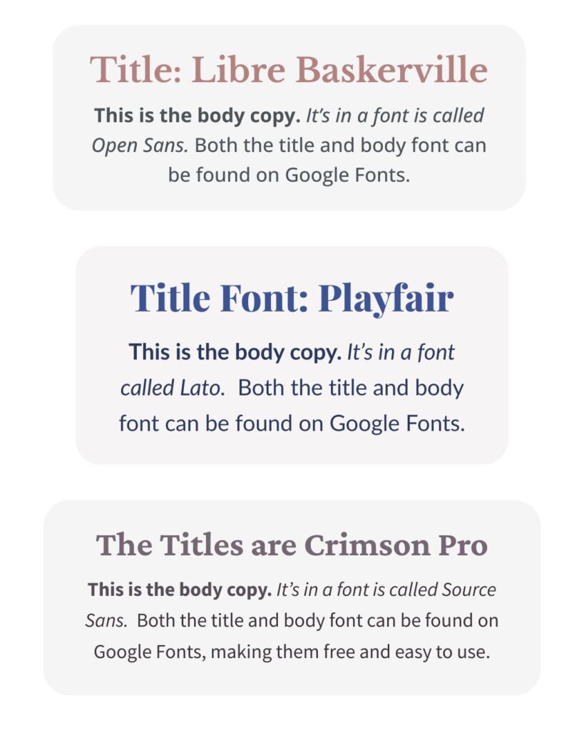
Like we did with colors, choose 1-2 fonts and stick with them. I recommend choosing a headline font (something with a bit of personality) and a body font (something super readable) and again, write the names down somewhere you’ll remember (time to open that note on your phone back up!).
If the font used in your logo is easily accessible, that’s a perfect place to start, as long as it has a webfont version for your website. If not, Google Fonts is a great place to find fonts that work everywhere – from your website to Canva.
Keeping your fonts consistent helps your brand feel more put-together without you having to overthink every new piece you create (and your future self will definitely thank you when trying to throw together an Instagram story at the last minute.)
3. Know Your Audience
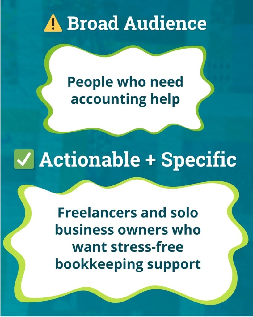
Take a few moments to write down who your brand is actually for. I know it’s tempting to say “everyone!” (been there), but narrowing this down helps the right people feel like they’ve landed in the right place when they visit your website.
For example, instead of “anyone who cares about the environment,” a home composting service might focus on “local families looking for easy ways to reduce food waste.” That shift helps shape everything from your home page headline to the photos you choose.
This doesn’t mean you won’t work with people outside your “main” audience. It just means your website messaging speaks most clearly to the people you’d love to serve most – and they’re much more likely to click, donate, or sign up because they feel like you’re talking directly to them.
4. Define Your Voice
Write down a few words that describe your brand’s overall vibe – also known as your brand voice. Are you friendly? Professional? Energetic? All three?
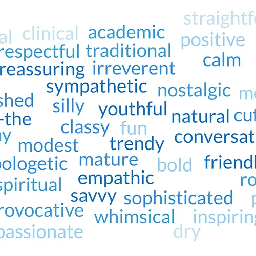
If you’re having trouble describing your voice, think about how you naturally communicate with clients you love. Maybe you’re “warm but straightforward” or “joyfully educational” or “calmly confident.”
These descriptions become your secret weapon when you’re wondering, “does this sound like me?” And your brand voice isn’t just for emails or social media; it shapes your website, too. Your homepage headline, About page intro, and even the text on your buttons (“Get Started” vs. “Let’s Begin”) should sound like you.
5. Use the Right Logo Files
Your brand is more than your logo, but your logo is still one of the most visible pieces of your brand. It’s often the very first thing people notice on your website, so making sure it looks sharp and professional goes a long way in building consistency and trust.
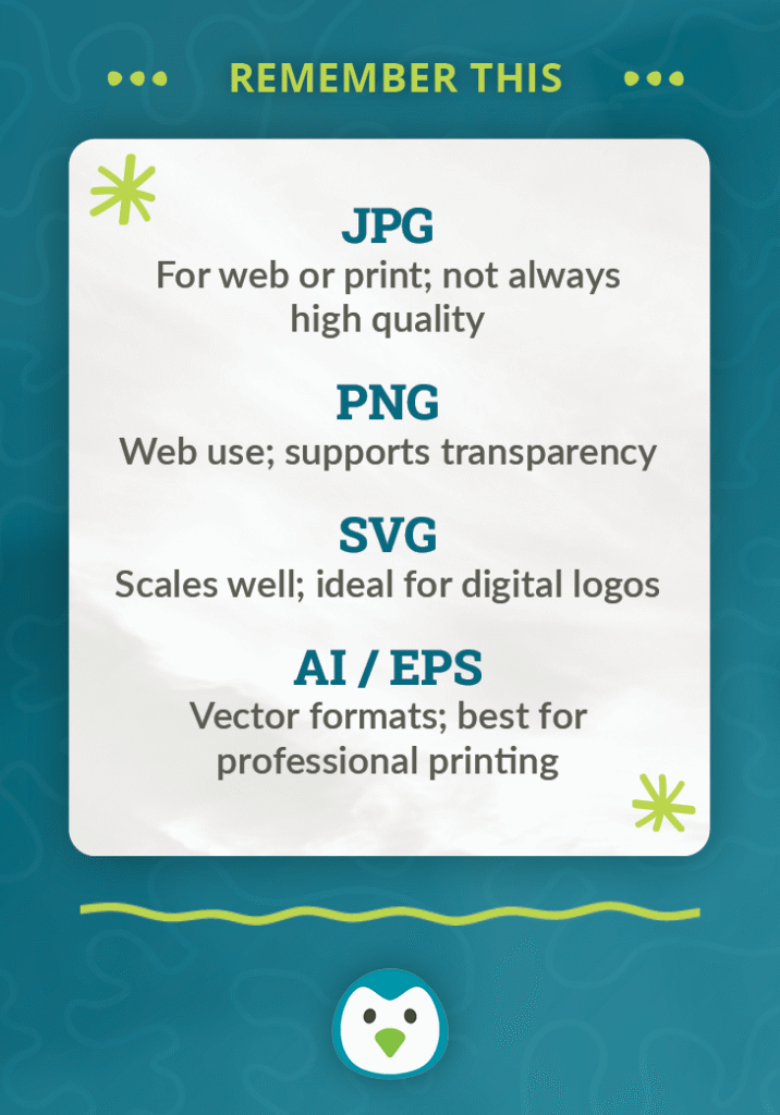
Here are the formats you’ll most commonly use:
- SVG: Scales beautifully on all devices without getting blurry.
- PNG: Great for logos or graphics when you need a transparent background.
- JPG: Works for photos or simple graphics where transparency isn’t needed.
Other formats you see (AI, EPS, PDF) are super important for print projects, but you won’t actually upload those to your website.
Having the right logo file ready when you need it helps your brand look polished and cohesive – no more stretched, pixelated, or oddly cropped versions sneaking in!
Final Thoughts
Phew…that might have felt like a lot, but take a breath: your branding doesn’t need to be perfect (we’re not Nike or Apple here!). The real goal is simply to build a brand that feels familiar and trustworthy. On your website, that often looks like consistent colors, fonts, tone, and a logo that shows up crisp instead of blurry.
Remember: you don’t have to start from scratch. A little thought and organization goes a long way in making your brand feel more connected, recognizable, and authentically you.
✨ Ready to pull your brand together?
It’s wayyy easier to stay consistent when your colors, fonts, logo, and tone are all in one place.
🎁 Grab my free One-Page Brand Guidelines Canva Template to start filling in the pieces you already have. Just drop your email below and I’ll send it straight to your inbox. ⬇️
By signing up, you’ll also join my mailing list. I send 1–2 helpful emails a month – no spam or anything, just tips & resources to make dealing with your website faster & easier.