
Web Accessibility for Small Businesses: A Beginner’s Guide

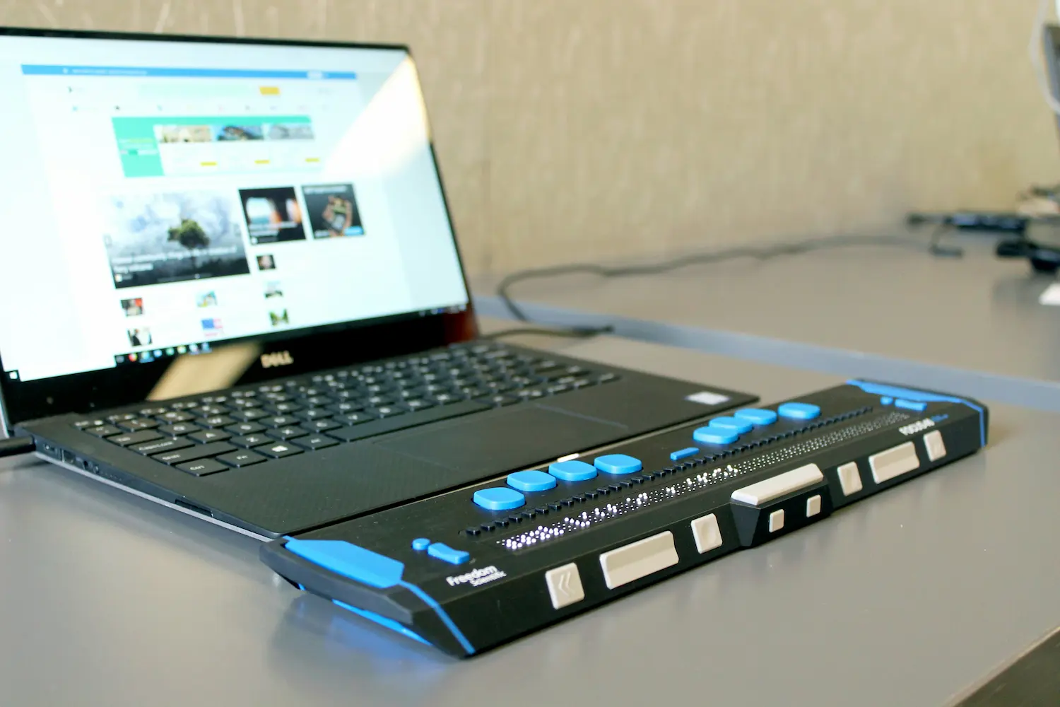
61 million adults in the US live with some sort of disability, and some of those folks are bound to end up on your website. Some of them may use screen readers to navigate the internet. Others use only a…
 Recent Posts
 Recent Posts
A Simple Homepage Audit You Can Do Yourself
How do you feel about your website? What about your homepage? The odds are, what you think about one is similar to what you think about the other. Even if you’re not feeling great about your website, don’t rush into a redesign. After all, with everything going on…

How to Write an Effective Website Headline (With Examples)
You’ve heard of the 5-second rule for food, but did you know there’s a 10-second rule for websites? That’s how long you have to capture a visitor’s attention when they’re deciding whether to stay or leave. And what’s the first thing a user sees on your website? Your…

7 Easy Website Fixes for Small Businesses
Have you ever looked at your website and thought…this probably needs some attention? Maybe a photo is outdated, a link is broken, or your footer still says © 2016. Those little issues can pile up fast, and suddenly your website starts to feel like a much bigger project…

How to Speed Up Your Website by Optimizing Your Images
Folks are busier than ever nowadays, and that means they’re not going to wait around for a sloth-like website to load. And if you’ve noticed some sluggishness in your site, the most likely culprit is oversized images. The good news is that this is one of the easiest…
5 Website Branding Basics to Pull Your Site Together
Branding is one of those words that can feel intimidating. It conjures images of big companies with massive budgets, agency teams, and years of careful positioning. Think Apple. Think Starbucks. But branding is not just for huge companies. On a small business website, branding is about making it…

Is Your Website Hard to Read? How to Check + Fix Color Contrast
Have you ever pulled up your website and found yourself squinting just a little bit? Nothing’s broken, but it just feels a bit hard to look at? Often the issue isn’t the layout or the text size or the content itself – it’s the color contrast between your…

How to Test Your Website Contact Form
Maybe it’s because the tiny internet gremlins get bored, but contact forms have a sneaky way of breaking when no one is looking. And since your contact form is one of the main ways people reach out, that can mean missed messages, frustrated visitors, and perhaps even opportunities…
How to Organize Your Website Login Details (Before You Need Them)
Picture this: a customer emails to let you know their name is misspelled on your website. No big deal, right? You just need to log in and fix it. Except…you can’t. Once you sit down at your computer, you realize you have no idea where that login is,…

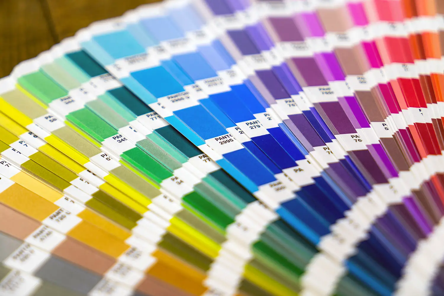
Skip the Guesswork: 3 Website-Ready Palettes (with Font Pairings)
We’ve alllll seen the endless color palettes floating around Pinterest. They’re fun and gorgeous, but many of them aren’t built for real-world design: colors too light for text, too busy for buttons, or using fonts that aren’t even available. That’s why I pulled together 3 palettes you can…