


How do you feel about your website? What about your homepage? The odds are, what you think about one is similar to what you think about the other.
Even if you’re not feeling great about your website, don’t rush into a redesign.
After all, with everything going on in the world, who wants to spend their precious time (and money!) starting over with a brand new website?
Let’s walk through your homepage together and make a few improvements so your current website can continue working hard for you.
Effective Homepage Ingredients
But what does a homepage that works look like? An effective homepage does three things:
- Clearly says who you are and who you help
- Explains exactly what you do (don’t make people guess!)
- Gives folks something obvious to do next
Start With What Visitors See First
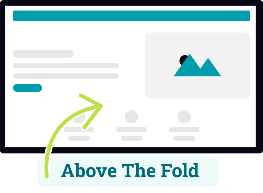
The highest impact section of your homepage is what’s “above the fold,” meaning everything visitors can see before they start scrolling.
🦸♀️ Hero Section
A hero section is one of the most common ways to use that above the fold space. Hero sections typically have a large headline, a small amount of text, and a call to action button that gives the visitor something to do right at the top of the page.
An effective hero section tells folks who you are, what you do, and what you want them to do next, all without having to scroll…which covers all of the three things on that effective homepage list (score!). Let’s break down each part:
✏️ Write a Clear Headline
Your homepage headline should be clear, not vague (“Welcome”) or clever (no troll bridge riddles!). I have a whole post dedicated to writing effective headlines because it’s thaaat important!
A good website headline is specific and tells both visitors and search engines who you are and what you do:
- Affordable Floral Design for Denver Weddings
- Virtual Assistant for Creative Professionals
- A Zero-Waste Refill Market in Aurora
[What You Do] for [Who] is a simple formula you can use to build a better headline.
👏 Tell Visitors What to Do Next
Is there one clear next step for visitors to take without scrolling?
This is your call to action, and it should be obvious and easy to find. Think about it this way: if someone only spends 5 seconds on your website, will they know what to do next?
The call to action in a hero section is typically styled as a button (this helps it stand out), but it can also be a regular text link.
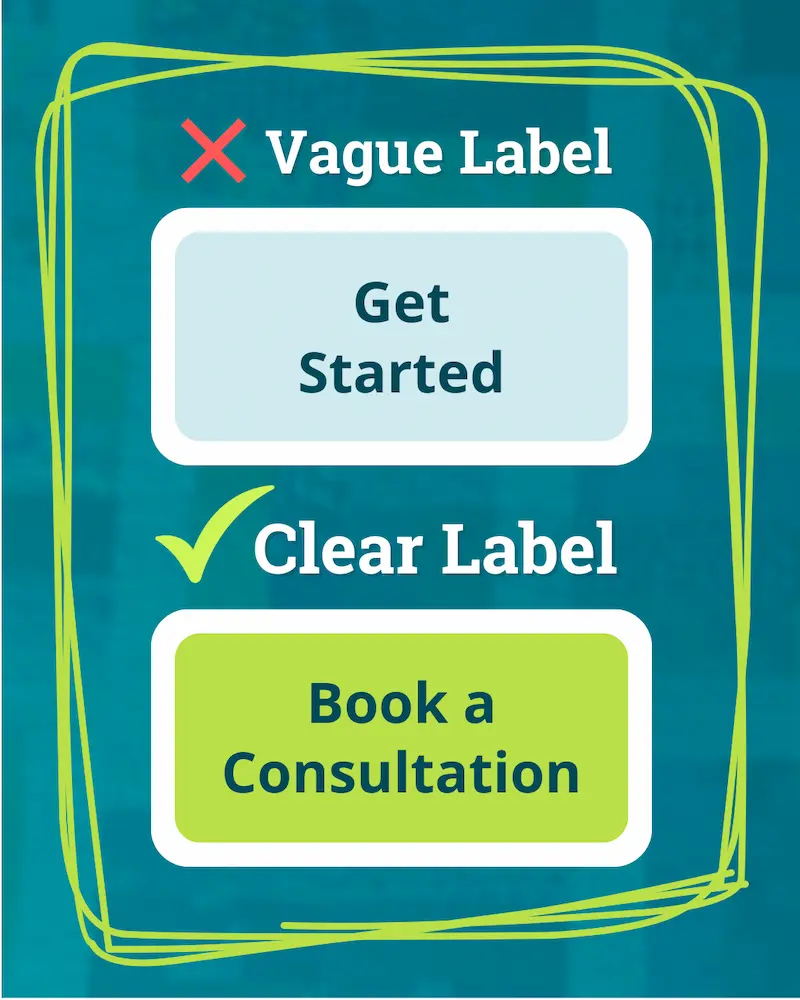
⚠️ Button labels should be specific!
How you label your call to action is important, too – visitors should know exactly what’s going to happen when they click on a button.
For example, Get Started may leave them questioning what happens next, but Book a Consultation is specific and clear.
👀 Feeling like you’d rather have someone else do the testing for you? That’s exactly what my free Homepage Audit is for. I work through these same checks with your homepage, then share what I find and what to work on first!
More Homepage Checks
The hero section is the most important part of your homepage, so if you only tackle one section, make it that one!
But if you’re ready to evaluate the rest of your homepage, here are some more areas worth checking:
🤝 Add or Strengthen Trust Signals
Trust signal is just a fancy term for anything you use to prove you’re a real person who knows what they’re doing.
You can build trust with visitors by:
- Including a real photo of yourself
- Sharing your story about why you do what you do
- Including testimonials from clients
- Sharing recent work you’ve completed
You can also add links to news articles or brief customer quotes within other page copy. Anything that helps answer the question, “can I trust this person?” counts!
🔗 Clean Up Your Navigation
If your navigation menu is hard to find, cluttered, or confusing, visitors may never make it past your homepage. Here’s what to check:
- Are there too many links? Most websites should stick to 5-8 main navigation links. Additional pages can be added in dropdown menus below those categories, but those should be focused and limited too.
- Are the labels clear? Navigation labels should be short and obvious, meaning Contact is actually a better label than Let’s Connect (even if it feels a bit boring!)
- Is the navigation easy to use? This is a more subjective topic, but you want menu labels to be large enough that they’re easy to read. Also make sure any dropdowns stay on screen long enough that someone is able to click on the links.
📱 Do a Quick Mobile Check
Before we wrap these checks up, open your site on your phone and take a look at your homepage.
- Is your headline completely visible and big enough to read?
- Is the call to action button in your hero section easy to read and tap?
- Is your navigation easy to use (check any dropdowns too)?
- Are your other homepage sections readable and stacked in a way that makes sense?
What to Fix First
We’ve worked through a lot of categories in this post, but I want you to know exactly what to work on first (to prevent any doom spirals that make you want to start over!)
🐾 Your Next Step
Pick 1–2 changes you found while working through this list, and ignore everything else for now. Our goal here is always progress, not perfection!
My recommendation: if your hero section didn’t pass both of the tests (good headline + clear call to action), start with that – it’ll help more visitors decide to stick around!
😫 Feeling overwhelmed?
If you’d rather have someone work through this list for you – you’ve found that person (it’s me!). I offer Free Homepage Audits where I go through these same homepage checks, then send you a video walkthrough and short report to show you exactly what I’d change.
Better Homepage = Better Website
Remember: your homepage doesn’t need to be art-gallery-levels of perfect. It just needs to do its job: tell visitors who you are, what you do, and guide them to an obvious next step.
And none of this requires starting over with a new site. A headline tweak here or a testimonial there gives your current homepage a new life and helps more folks who land on your website take the next step.
👀 Want expert eyes on your website?
Like I mentioned above, I offer completely free Homepage Audits to everyone who joins email community. It’s a very kind (I promise!) look at the things your website is doing fantastically and the things that could make it work even better for your business.