

Have you ever pulled up your website and found yourself squinting just a little bit? Nothing’s broken, but it just feels a bit hard to look at?
Often the issue isn’t the layout or the text size or the content itself – it’s the color contrast between your text and the background.
This is something I’ve noticed more with the recent trend toward (gorgeous!) muted color palettes, so I wanted to take a moment to address it. The good news is that contrast is super quick to check and fix!
Why Color Contrast Matters
When folks visit our websites, the goal is simple: make it as easy as possible for them to read and navigate so they’ll stick around and learn more.
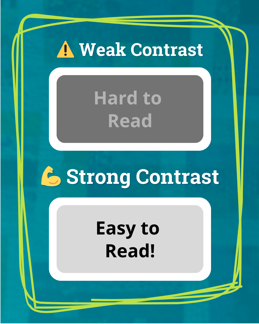
Color contrast is a big part of that. Strong contrast makes text easier to read. Weak contrast makes things start to blur together, especially when the colors are close in value.
When contrast is strong, your website feels polished and professional, which naturally builds trust. But when visitors have to squint or zoom just to read your homepage, something feels “off.” And that tiny bit of friction plants a seed of doubt and erode trust.
Strong color contrast isn’t just a kind accessibility practice – it’s a smart choice that helps all of your visitors and a small website improvement that makes your site easier to use overall. So let’s look at how to check (and fix) your contrast.
How to Check Your Website’s Color Contrast
- Choose a page on your website to test. If you’re not sure where to start, your homepage is a good call.
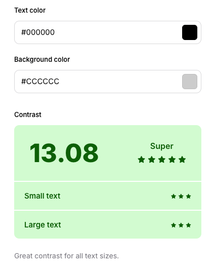
- Grab your text and background HEX colors. You’ll find these in your website editor, or use a color picker tool to pull them from a screenshot.
- Paste the color codes into a contrast checker. Just make sure you have the text color and the background color in the right spots.
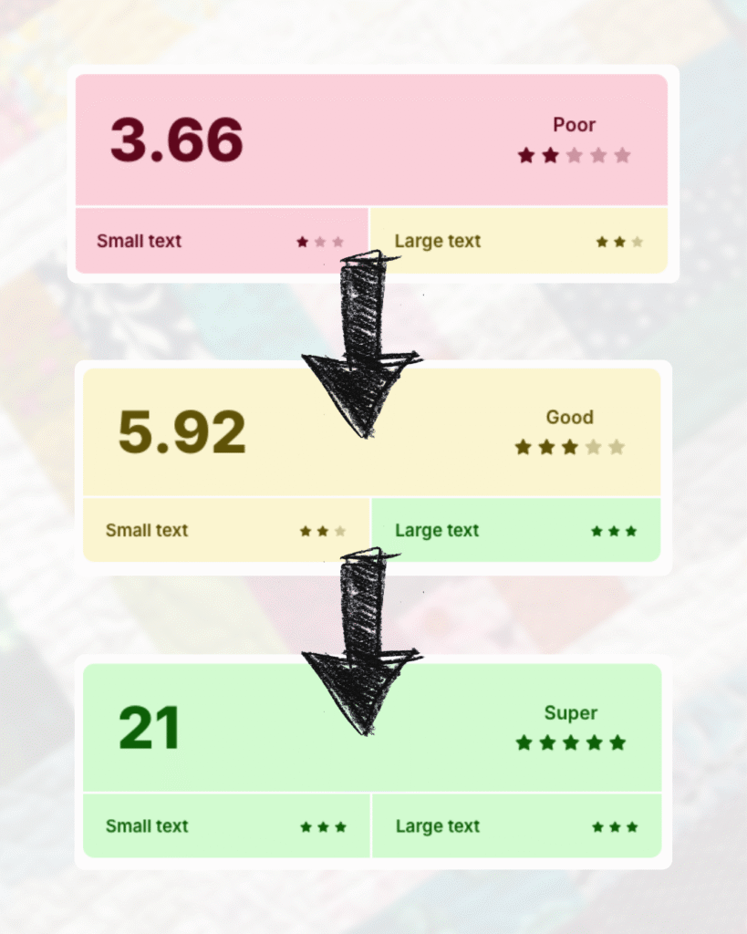
- Check the results. Body text needs stronger contrast than headlines, since smaller text is harder to read.
Test more than one spot. Sidebars, buttons, or callout boxes often use different colors than your main body text. Same with text over a background image – if it’s hard to read there, it still should be addressed.
🤝 Need help with this? Testing and fixing color contrast is one of the many things I can take care of during a Website Reset Day!
How to Fix Poor Color Contrast
If your report came back with a “poor” rating, it’s okay! Now you’ve found something concrete to adjust, and honestly, checking it was the hardest part.
Here are a few simple ways to fix it:
- Darken the text. Paste the HEX color code of your text into a tints and shades generator and grab a slightly darker version. Even a small shift can make a big difference.
- Lighten the background. If your text is already dark, try going lighter with the background. The same generator works here, or if you’re using an image background, lowering the opacity helps the text stands out more.
- Add a tinted box. Love your image background? You can keep it by adding a colored box behind your text so the words don’t get lost.
After making these changes, rerun the contrast checker to see the updated results.
Better Contrast, Better Experience
Color contrast is one of those little details that can quietly make a big difference. When your text is easier to read, your website is easier to use, and visitors are more likely to stick around, learn more, and take the next step.
Don’t want to tackle these checks yourself? It’s one of the things I tackle in my Website Reviews!
✨ Want more quick website wins?

🎁 Grab my free 15-Minute Website Wins mini guide: simple fixes to make your site run smoother & look more trustworthy. Just enter your email and I’ll send it straight to your inbox. ⬇️
By signing up, you’ll also join my mailing list. I send 1–2 helpful emails a month – no spam or anything, just tips & resources to make dealing with your website faster & easier.