


61 million adults in the US live with some sort of disability, and some of those folks are bound to end up on your website.
Some of them may use screen readers to navigate the internet.
Others use only a keyboard, rely on screen magnification, need enhanced color contrast, increased text size, or reduced motion.
So it’s safe to say that not everyone experiences the web the same way.
And for small businesses, that’s really what web accessibility comes down to: if someone lands on your site, will they actually be able to use it to find out who you are and what you offer?
What Does Website Accessibility Mean?
Website accessibility means making sure all digital content is usable for people with disabilities.
To help website owners achieve this, a group of smart and caring folks put together the Web Content Accessibility Guidelines (WCAG).
WCAG is organized by four main principles, referred to by the acronym POUR. These mean your content must be:
- Perceivable: present your content in a way all visitors can experience, regardless of what senses they use
- Operable: make your content and user interface elements (like buttons and links) easy to use no matter how someone interacts with them
- Understandable: your content and user interface elements should be clear and easy to understand
- Robust: your content should work on a variety of web browsers and assistive devices
Why Does Web Accessibility Matter?
Accessibility clearly helps people with disabilities, but the truth is accessibility helps every person who lands on your website, regardless of abilities.
Everyone benefits from a website that’s easy to use and content that’s easy to read.
That means more people who land on your website will stick around long enough to take the next step. And that’s just good business.
How to Start Making Your Website Accessible
If you took a peek at the WCAG website, you probably noticed the list of things to check to make your website accessible is quiiiiiite extensive.
So for now, let’s just focus on a few common issues that will make a huge difference to your visitors.
1. Make Sure Images Have Alt Text
Alt text is the description of an image that you don’t typically see – it’s only shown if the image won’t load.
But screen readers use alt text to describe the image to people who can’t see it. And Google can’t see images either, so it also uses the alt text to understand what an image is, which can help it show up in search results.
The Fix: Add Alt Text to Images

When you upload an image, you will see a text box labeled ‘Alt Text’ where you can type a description of the image.
Always fill this in, unless the image is only used for decorative purposes. Describe what’s in the image and why you used it to give context.
- No Alt Text: “IMG_4287.jpg”
- Meh Alt Text: “woman at desk”
- Good Alt Text: “Christina, founder of Bright Ledger Bookkeeping, working at her home office.”
To see instructions for your particular platform, here’s how to add alt text in WordPress, Squarespace, and Wix or search “alt text + [your website platform].”
2. Avoid Vague Button and Link Text

When adding links or buttons, it can be tempting to make the text “click here” – after all, that’s what you want people to do. But that doesn’t tell them what happens after they click.
This is an accessibility issue because screen readers provide a list of all links on the page, so users are presented the link by itself without any additional context. That means instead of “Click here to download my free checklist” they just hear “Click here.”
But honestly, improving your action text helps all your visitors. Most people scan pages rather than read them nowadays, and descriptive links make it easier to find what they’re looking for.
The Fix: Write Clear Button and Link Text
Scan your site for any link or button text that says “click here,” “get started,” or “learn more” and update the text to describe what happens after someone clicks.
- Click Here → Download My Free Guide
- Learn More → View Services
- Get Started → Book a Discovery Call
3. Have Enough Color Contrast
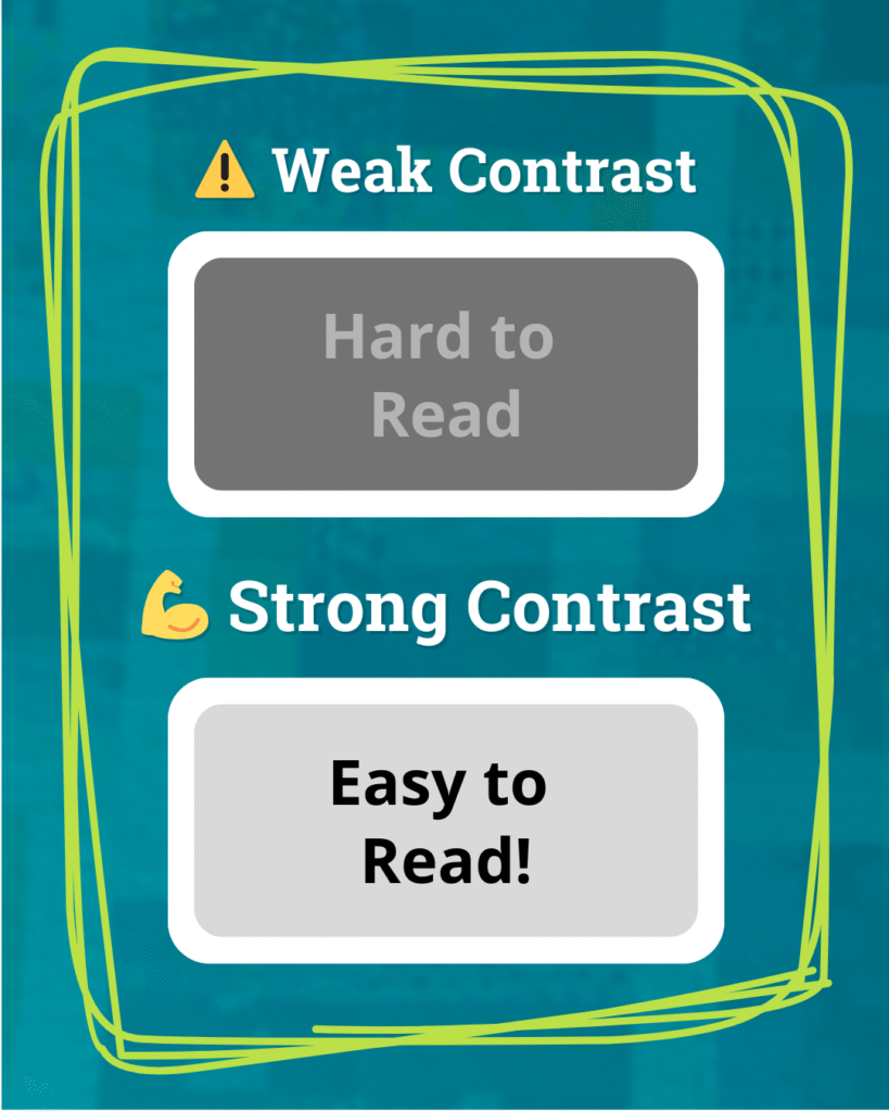
The difference between your background color and the text color is called color contrast, and with the trend of (lovely) muted color schemes, not having enough contrast has become a common accessibility issue.
Not having enough contrast makes your text hard (or even impossible) to read for people with visual impairments or color blindness – and it can give folks without those issues a headache, too. Bright lights, older screens, or tired eyes can all make low contrast text a pain to read.
The Fix: Check Your Color Contrast
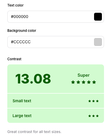
Use a free contrast checking tool like WebAIM to test the contrast between your text and background color. If you use different colors for your headings, body text, and links, be sure to test all of them.
Another super common contrast issue is text that sits on top of an image or a colored background, like in pull quotes or hero sections.
This can be corrected by making the background lighter and the text darker (or vice-versa!). Making background images more transparent so the background color shows through more can help too (read my color contrast deep-dive for the details on this).
4. Use a Logical Heading Structure

When you add text to your website, most platforms give you the option to format it as a heading. You’ve probably seen the dropdown that says Heading 1, Heading 2, Heading 3 and so on, and maybe just picked whichever one looked to be the right size (which is totally understandable!).
Those different heading sizes aren’t just for visual effect, though. They work together to create an outline of the page, which tells both screen readers and Google how the page is organized. Typically Heading 1 is your page headline, Heading 2 is a section title, etc.
Screen readers use this outline to allow users to jump between sections. If your headings are out of order or you jump from a Heading 2 to a Heading 5 because it looks better visually, that structure falls apart.
The Fix: Clean Up Your Heading Structure
Review each page on your website to make sure your headings are in order using this Heading Tag Checker tool. Some rules to keep in mind:
- Each page should only have one Heading 1 (H1).
- Use H2s for your page sections, and H3s for subsections, and so on through Heading 6 (H6).
- Don’t skip levels. The headings should be in order within each section.
- If you need to change the look of a heading, first place the correct heading, then override the text size manually in your website editor.
Accessibility Is Good for Everyone
The fixes we discussed in this post will help all of your visitors – not just those who land on your website using accessibility aids.
Using good accessibility practices makes the overall experience of using your site better, and that encourages more visitors to stick around and take the next step.
👀 Want Accessibility Help?
If you’d rather leave the accessibility testing to me, it’s one of the many things I test in a Website Review. I’ll run though the checks in this post (plus many more!) and give you an actionable checklist of fixes you can tackle yourself or hand off to your web designer.