 Spring Clean Your Website: A Friendly Website Checklist


You know that feeling when you look at your website and think, "ohhhhh no...this is probably beyond saving. There's a picture of Judy on the about page and she hasn't worked here in 3 years, we're no longer open on Mondays, and there's like 14 links that aren't working!"
I get it: all those little tasks pile up into a big mountain of overwhelm. It's suuuper tempting to believe you need a complete do-over; to burn it all down and start fresh with something new and shiny and unbroken.
I feel this might be a web designer secret or something, but the truth is: most websites aren't as unsalvageable as they feel in those moments of late-night despair. They just need some thoughtful attention and a few strategic updates...I guess it's kind of like spring cleaning for your website!
So get your imaginary broom and dustpan ready and let's move through some tiny, low-pressure fixes you can make to your existing website -- no "delete everything and start over" panic necessary. In the end, your website will feel revitalized, easier to use, and more trustworthy. Let's get started!
Before we dive in: if you love a cute handout, I’ve got a Website Bingo freebie you can use at the end of this post! 🎉
These bite-sized tasks are all designed to feel (and be!) super doable. None should take more than an hour, and if you knock out one or two a week you'll be done in no time...although once you get started you might zoom through them all in a day or two! But remember: we are alllll about tiny wins here - just do what you can when you have the spoons to do it!
You'll probably want to take notes in a notebook or in your Notes app as you move through the tweaks below and figure out which ones apply to you. That way you can have an organized list to take to your web developer or to tackle on your own!
Note: If you get overwhelmed, I would be happy to help you with any of these and more - just fill out the Start Here form and I'll get to work!
In the US, phone users make up almost 50% of all web traffic, so having a website that works well on mobile is a must.
To start, pull up your website on your phone and navigate through the pages, paying attention to the following:
Read your home page.
Tap every button you see.
Check the navigation menu.
Look at a few images.
Did you find any broken links when you were testing your site on mobile? If so, and you have the ability to edit your site, choose just one to fix. That's it! (Although I do feel like fixing things is kind of satisfying once you get started)
Choose one blurry, tiny or outdated photo and replace it. That's it!
For bonus points from Ty and myself, add alt text when you replace it so folks navigating the web with screen readers can understand your new photo too. If you're not sure how to do this, search for "how to add alt text to a photo [your website platform, like Wordpress/Squarespace/Shopify etc]"
I'm going to make a bold statement here and say that your contact form (if you have one, that is) is the most important part of your website. Having everything in working order here ensures you don't miss out on any opportunities your visitors may want to send your way!
To test your form, simply send yourself a test message, being careful to fill out all available fields. Then, check your inbox and to make sure it actually arrives and that all of the information you filled out is visible.
When someone visits your site on their phone, they don't want to copy-paste your email address or squint at your phone number to type it in. They just want to click (or tap!) and go.
If you tap them, and nothing happens, you can fix this in your website editor. Every platform is a bit different, but in general:
mailto:yourorg.com/contact, it should link to mailto:hello@yourorg.comtel: tel:1234567890The landscape of social media is constantly changing, so be sure any social links on your site are still working. These are commonly found in the header (top of your page), footer (bottom of your page) or sometimes on the contact page.
This is another important one to check on your phone, too, as sometimes mobile menus display different links than the desktop version of your website.
Having a polished home page earns you major trust points. Read through all of the content on your page, and make a note to update any typos or outdated information. This is a good place to refresh that photo we mentioned above too!
Your footer is that space at the bottom of your website that commonly contains your logo, maybe some navigation and copyright information - since it's at the bottom of the page, it's easy to forget about or overlook.
Take a peek and make note of any outdated information. Check the year, links and any other information contained in the footer (commonly places with a physical location will put their hours or address here).
These small tweaks really do matter - even without rebuilding your site or changing your design, taking the time to make these updates shows visitors that you care about your website, which builds trust in your organization.
And remember, just like spring cleaning, you don't have to tackle everything at once (even if your hyperfocus says YOU MUST!). Your website (and your future visitors) will thank you for every little update you make - even completing one is a huge win!
Feeling inspired to tidy things up? I made a little something to make it even easier.
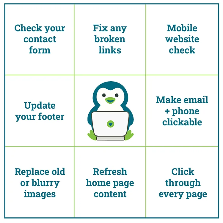 This free 1-page download includes:
👉 Download the free Website Bingo card (PDF)
No email required, just a little gift from me (and Ty the penguin 🐧) to help you feel good about your website again.
Are you in my cozy community? You’ll also find it waiting for you inside Ty’s Little Free Library.