 Better Social Media Graphics: Design Tips for Small Businesses
Are you ready for a wild statistic? According to a study from Microsoft, the average person's attention wanders after only 8 seconds - y'all, that's less than the notoriously-forgetful goldfish! If you’re a small business owner trying to promote your work on social media, this stat says it all: your Instagram graphics or social media posts have to stop someone's scrolling with a quickness. But how do you do that when you don’t have a designer on staff, Canva feels terrifying, and your big event is less than a week away?
The truth is: making effective social media graphics is hard. You've got to stand out amongst the other posts on someone's feed, get them to stop scrolling, and then convey information quickly before they resume scrolling. That's a lot of work for one little graphic!
If you've been graced with the task of putting those graphics together for your org, I want to start off by saying that you're doing great...and that the average engagement on an Instagram post is only 0.5%, so please don't beat yourself up for not going viral.
To help reduce that event-crunch-time stress and make your job a bit easier, I'm sharing 5 quick social media graphic dos and don'ts to make your DIY designing go more smoothly. There's absolutely no judgement here, just support!
Before we dive in: if you’re more of a hands-on learner, I’ve got a free Canva template you can try at the end of this post — plus a full set in Ty’s Little Free Library. 🎉
Consistency builds trust and recognition, so dive in and customize your template to make those colors to match what's in your brand guidelines (you did make those with me, right?).
Even if you’re partnering with another organization that has different branding, try to sneak in at least one of your own colors - it helps people know it’s you.
With audiences scrolling so quickly, they'll fly past anything that's too difficult for them to read. One major culprit here is contrast - the difference between your text color and the background behind it. As an example, maximum contrast would be black text on a white background, or vice-versa.
If you're curious about the contrast between two colors, you can quickly check using WebAIM's Contrast Checker. This is especially important for accessibility reasons as well as for mobile users who are viewing your graphic on small screens - they need that strong contrast to easily read your copy.
Bonus tip: If you’re feeling stuck, you can also make text easier to read by either making it a little bolder or a little bigger.
Keeping with the theme of "don't scroll, please!" limit the text on your graphics to only what is necessary for context. Short text is way more scannable, especially on mobile devices.
I get it: it might feel weird at first to leave these details out of the graphic itself, but it's actually a strategy! Our goal is to make people curious enough to read the caption or click a link for more.
To test your text, shrink your graphic down to roughly phone screen size (or even smaller) and make sure all of your copy is still easily readable.
Different platforms expect different dimensions, and if you don't use the right ones your graphics can have parts get cut off or have the image end up distorted, so it's worth taking the time to make multiple versions. Here's the preferred dimensions for the social media heavy hitters:
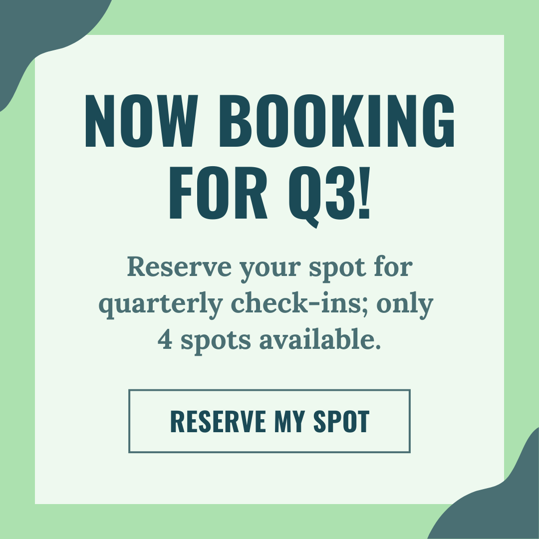
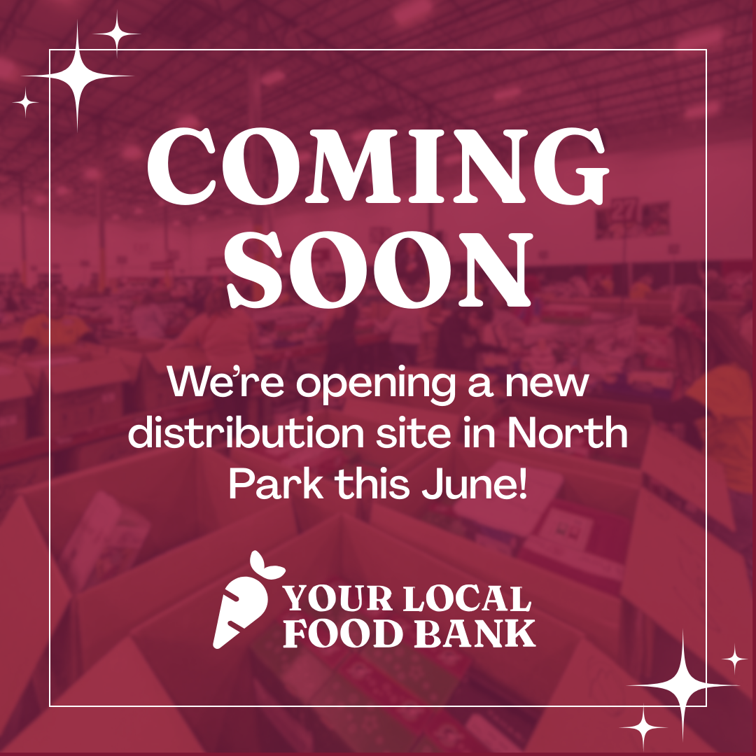
Not having to start from scratch or scroll through 1000 options in Canva every time you create a graphic is a lifesaver. If you know you rotate through the same types of posts - stories, announcements, events, sales/fundraisers, or photos/quotes - you can work up a reusable layout for each type.
Having these templates ready to go saves time, saves your brain from decision fatigue, and makes your posts feel cohesive: which is actually a smart strategy!
Cohesion helps your audience recognize your posts faster as they scroll...and that's what you want. And, real talk: unless you're Taylor Swift, I promise your audience is not going back and studying your full grid - most folks will only ever see a post or two at a time.
And if you’re worried about your feed feeling "too repetitive," here’s a cozy truth: if you posted a graphic similar to this six months ago (or even last week), no one will notice. And with small tweaks, like new images, updated text, or a fresh swap of a brand color, you can make a template feel brand new every time anyway. 🎉
Even with all of these tips in hand, let's be real: every post isn't going to be perfection and that's totally okay. Social media moves fast, so good enough really is good enough. Showing up on a consistent basis matters far more than creating some perfect graphic.
And that's the good news: we are alllll about progress over perfection here. With every graphic you improve just a little bit, that progress adds up. Each stronger post snowballs into a stronger brand over time.
Even if you only remember one thing from this post (I vote for making sure your text is easy to read!), that's still a huge win. You are a wonderful human for working to improve your designs, and just reach out if you run into any issues - I'm here for support!

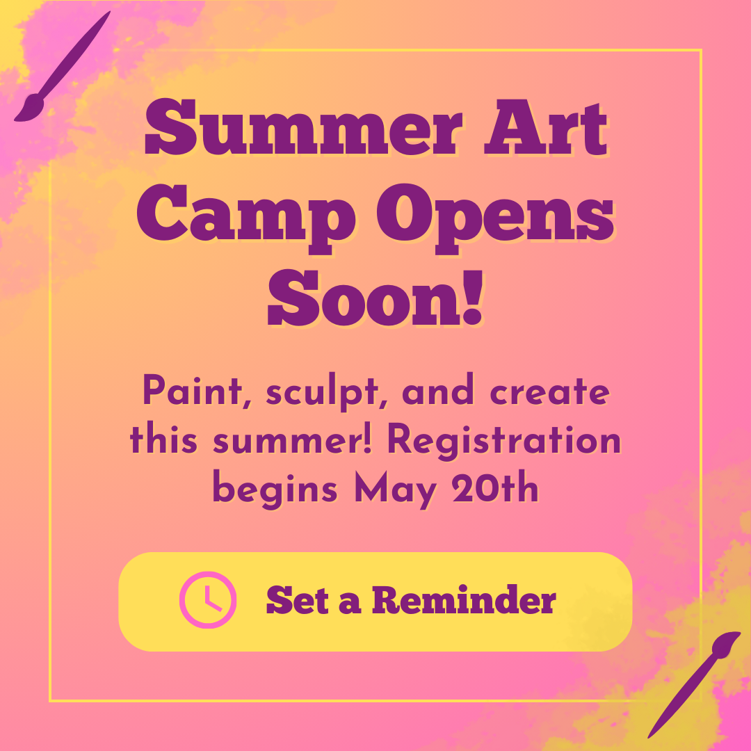
Need a quick win for your next post?
I made a simple, flexible Instagram announcement graphic you can customize in minutes with Canva — perfect for small business or nonprofit updates.
➡️ Get the Announcement Template
Want the full set, which includes fully editable templates for events, sales, fundraisers, stories, and celebrations?
🐧 You’ll find them waiting in Ty’s Little Free Library, free when you join my cozy little creative community. (No spam, just helpful tools and occasional updates)